This past winter I got to do the coolest project!
I was asked by Rachel Stinson at The Townsman Collective to paint a mural in their newest property; a historic home renovated into separate rentable apartment units here in Charlottesville, Virginia. Each room has a theme and I was tasked to paint a mural modeled after an old pharmacy/apothecary cabinet. The mural concept consisted of a large piece of antique cabinetry filled with apothecary bottles on open shelves. They were inspired after finding old medicine bottles at the property during the renovation. The apartment had stained-wood cabinetry on an adjacent wall as well as an original fireplace smack dab in the middle of where the mural was supposed to go. My goal was to create a mural that truly felt like belonged in that room and was built with the existing features in mind. Below is the timelapse video of the entire process from start to finish. Below the video, I explain the specifics of how it was done.
Creating a plan
Here were my main goals:
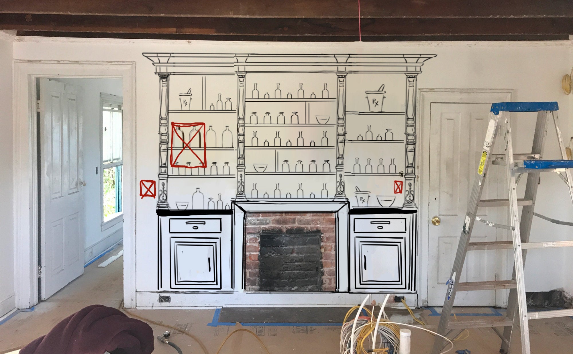
- incorporate the the existing fireplace as a thematic element of the mural
- match the paint colors of the mural cabinetry to the existing real cabinetry so that they both looked like they were made of the same materials
- paint the mural in the trompe l’oeil style so that it tricks the eye into perceiving that it’s 3 dimensional.
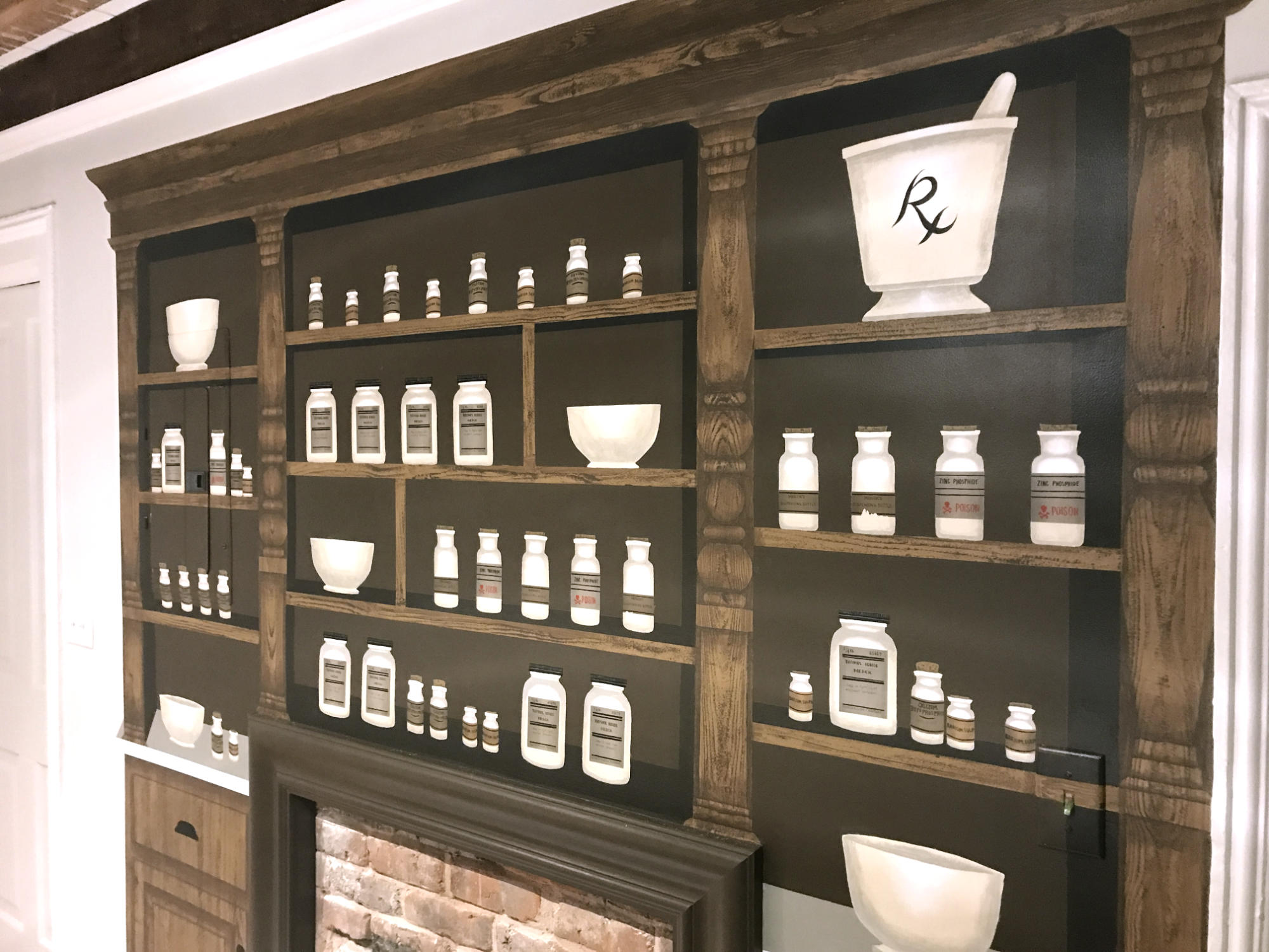
I accomplished the first task by making the fireplace the central focal point on the bottom and added a cabinet door on either side to create symmetry. The following is a very rough sketch that I superimposed on top of the bare wall where the mural was to go. The red markings you see delineate where the light switches and electrical breaker box are.
Making it match
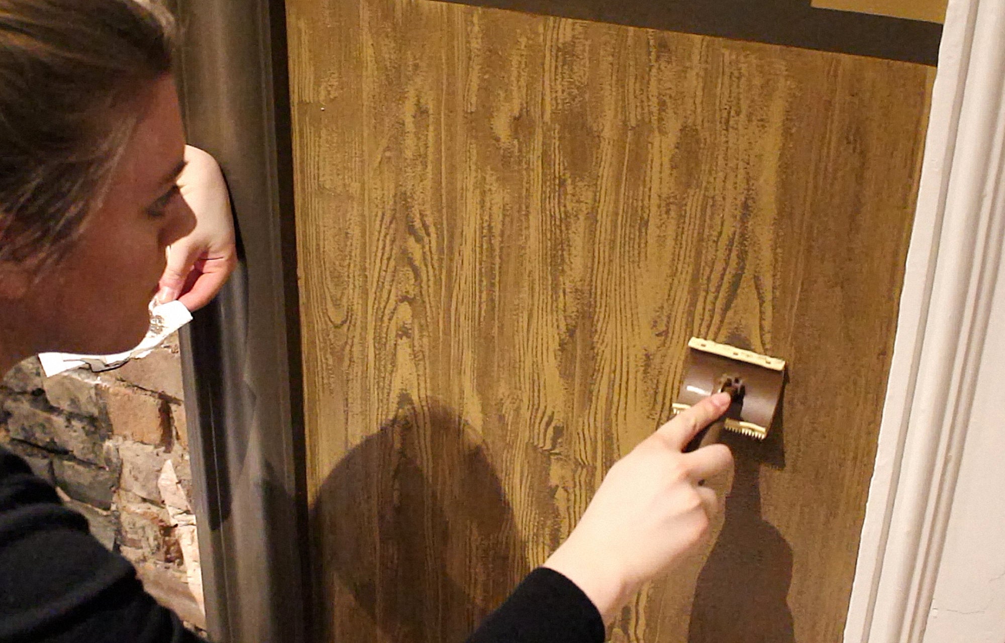
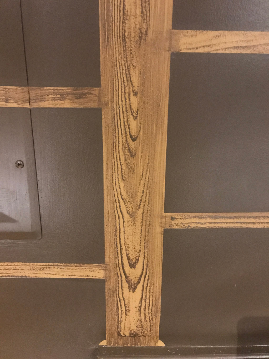
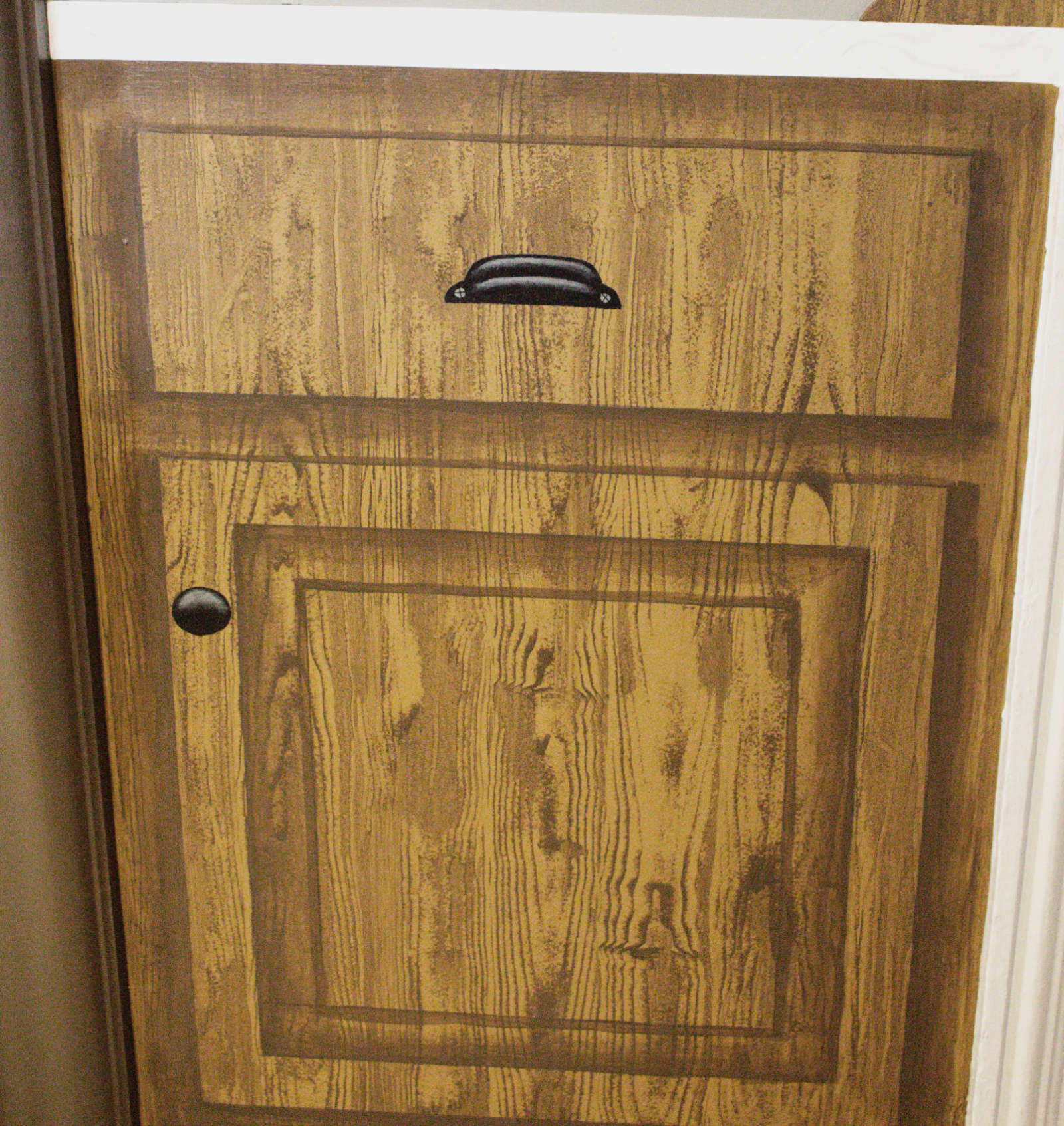
I accomplished the second task by taking a sample of the stained cabinetry wood to Lowe’s. There, from dozens of paint colors and after much deliberation, I chose one color for the lighter part of the wood and a darker color to match the wood grain. I wanted the wood texture to look as realistic as possible without taking me a lifetime to paint, so I did some research and picked up the neatest tool called a wood grainer. When you look at the tool, it’s difficult to understand how it would work, but I was amazed at the results!
I painted the background with the lighter paint color, letting it dry completely. Then, I took the darker paint color and made a less viscous, translucent glaze out of it by mixing in a little water. I dipped the wood grainer into the glaze, placed the tool at the top of the painted area and slowly dragged it downwards while gently rocking the tool back and forth. The tool has a raised, semi-circle pattern printed on it, so rocking it back and forth as I moved it accessed different parts of the pattern leaving a realistic wood grain effect behind.
Trompe l’oeil
Task 3 was the most time consuming and tedious part of the process: adding the 3-dimensional, trompe l’oeil style.
A lot of things went into play to get the proportions to feel authentic. Since the task of painting trompe l’oeil is to make a 2D space feel like a 3D space, it’s usually meant to be viewed from a particular vantage point in order for the proportions to make sense. The mural is the backdrop to the kitchen/living space so you’re up close and personal with it. The light source is a pendant light that hangs directly in front of the mural. Because of these two factors, I chose to paint the mural from the perspective of viewing it head-on, rather than at an angle. That being said, I was able to use my own frame of reference at a standing position to determine where the shadows and highlights would lay.
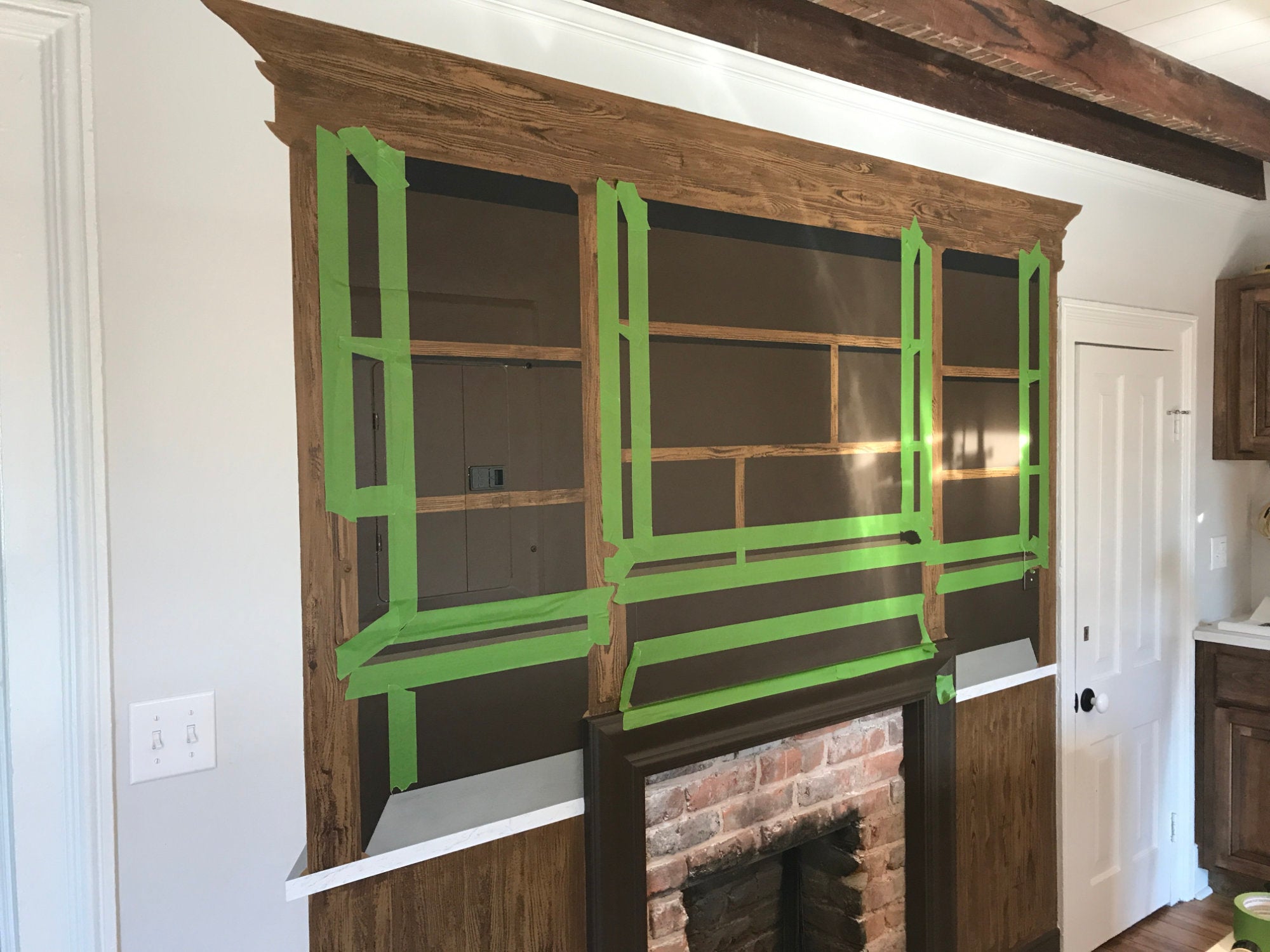
I opened the adjacent cabinet doors and observed where the vanishing point was and how far down the shadows fell below the shelves. I replicated what I saw onto the mural, isolating the shadow areas in painter’s tape.
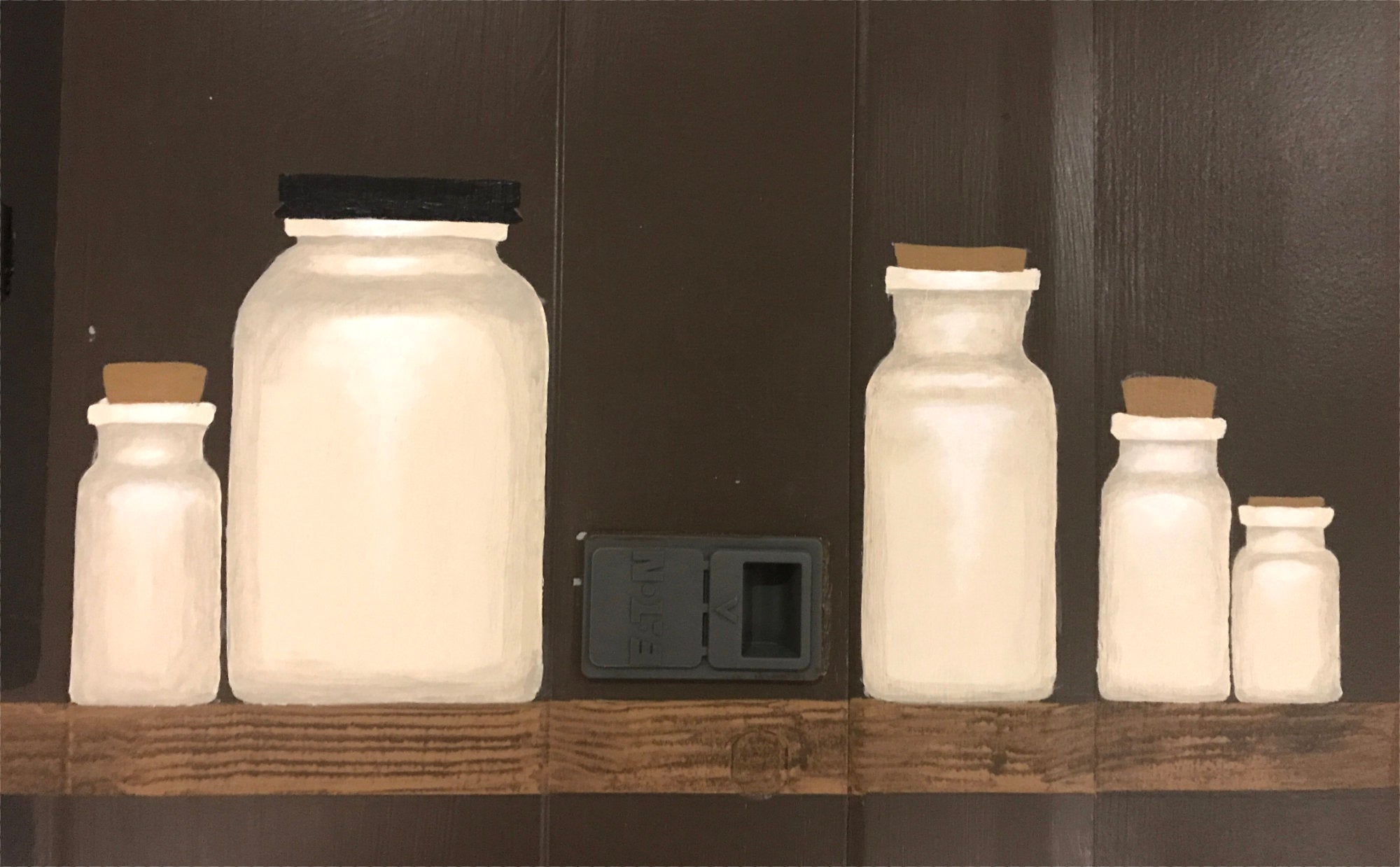
Other elements that were important in achieving depth included adding shading to the bottles and behind each bottle. We chose to make the bottles an opaque ceramic rather than clear glass so that they pop off of the dark brown background and lighten up the mural. I made the base color of the bottles an off-white color, that way the white highlights would be more visible and pop. The highlight went on the parts that would protrude out to the front in real life. The parts further inset got shading.
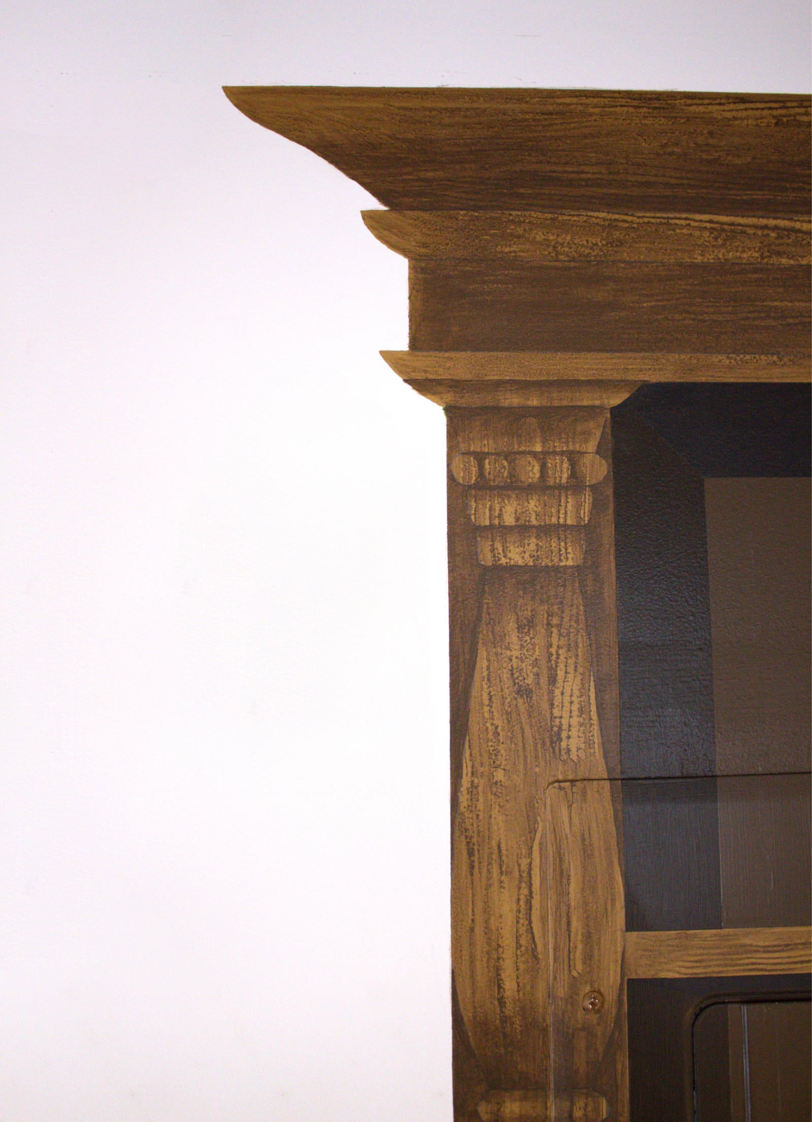
The last piece to the trompe l’oeil effect was adding dimension to the crown and decorative moulding on the wood cabinetry. I drew moulding shapes, cutting them out to use as stencils, so that the 4 column mouldings would be identical. All of the shading on the wood was done with a watered down paint glaze so that I wouldn’t cover up too much of the grain. This was the most effective step in transforming the piece into something that felt like you could reach out and touch it.
Final Details
Amongst the last bits to finish included hand writing each one of the labels on the bottles (also time consuming), cleaning up the lines around the bottles, adding texture to the cork and screw lids, and giving the whole piece a double coat of matte varnish to protect it from the wear and tear it might face.
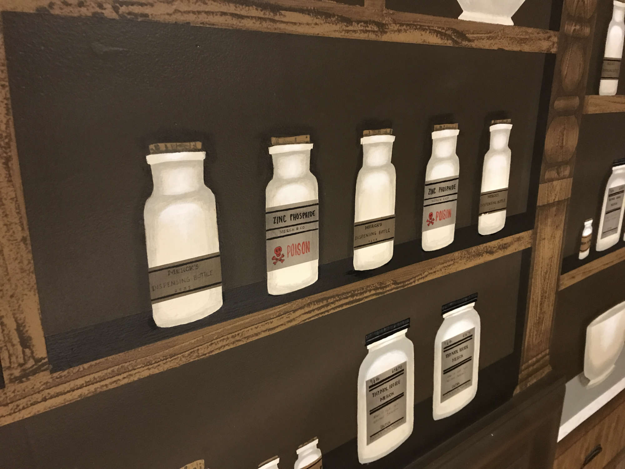
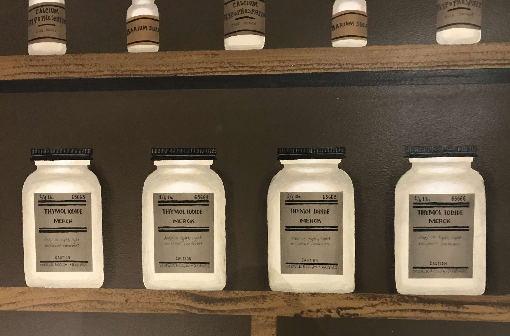
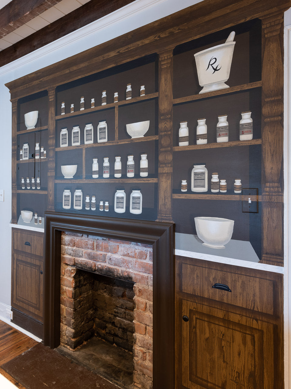
Photo by @barlingphotography
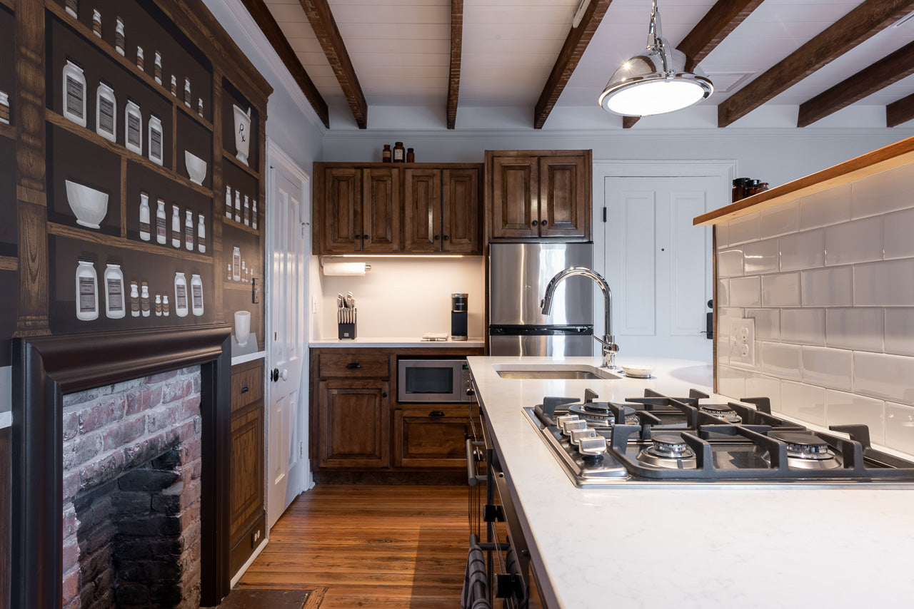

This was such a fun challenge that stretched my comfort zone and fulfilled my childhood dream of painting all over a wall without repercussions! It’s my largest piece to date and I’m so grateful to have been given the opportunity to create it. Many thanks to Rachel Stinson at The Townsman Collective. Follow them at @thetownsmancollection for more information about their properties.
